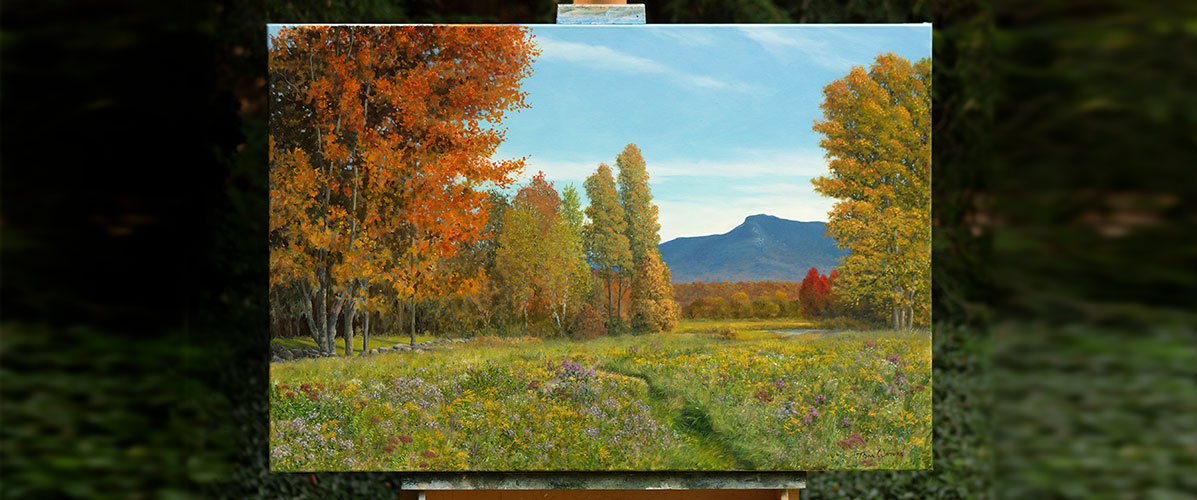
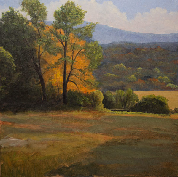
I recently received a question on how I painted some trees in the painting you see below. So I thought I would walk through this painting to illustrate how I went about getting the luminous quality of the backlit tree which is the focal point.
To start with, since the whole purpose of the painting was to capture that moment when light hits this group of trees creating a backlit glow, I thought about how best to capture that effect using paint. The three things I knew would help in this were the concept of simultaneous contrast (the effects of two colors next to each other), contrast (light and dark) and saturation.
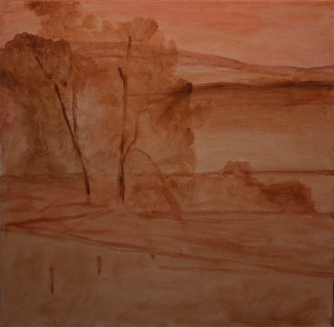
But before working out those details I knew I wanted to start with a colored ground for my canvas, using a color that would enhance the vividness of the orange tree. So I chose to cover my canvas with a combination of Cadmium Red Light and Burnet Umber. I could have chosen to use Yellow Ochre, but I wanted the red ground to add some energy to the hills and greens so I went with this choice. I knew the orange/yellows on top would pick up some of the undying redness and energy of the ground anywhere it peaked through and would maintain its brightness on top of it.
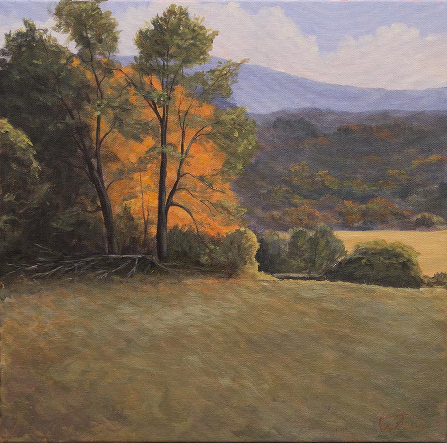
Next I blocked in colors just to get the composition down and start to establish areas of local color. So here in the planning stages is where I knew I wanted portions of the background sky and background hill to be directly adjacent to the brightly lit orange/yellow tree. The blues would energize the orange/yellows of the tree due to the property of simultaneous contrast.
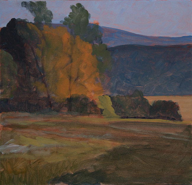
Notice in the above image that the orange tree does not yet pop out at you. Part of that is the dark photo, but part is the amount of green surrounding it which is less dramatic than when more of the blue gets worked in, partially its the lack of saturation and the value, and partially its the missing contrast of darks in front of it. But the basic color scheme is established.
In this next image I work more on the hill behind the trees, and you can see I have too much contrast and saturation in some highlights which draws your attention away from the main subject. I tone that down in the final piece, keeping less saturation and tonal variety in the areas away from the tree so that the main tree has more impact. You don’t need bright color everywhere in your painting, and keeping the saturation subdued in parts makes those areas of higher saturation have more resonance.
But notice how I have worked more blue of the background hills in around the tops and sides of the main tree. That tree has not changed from the color block-in, but it starts to gain luminance due to the simultaneous contrast of colors. you’ll note how I also kept more blue in the background hill just behind the right edge of the tree instead or working in the muted colors found in the rest of the hill.
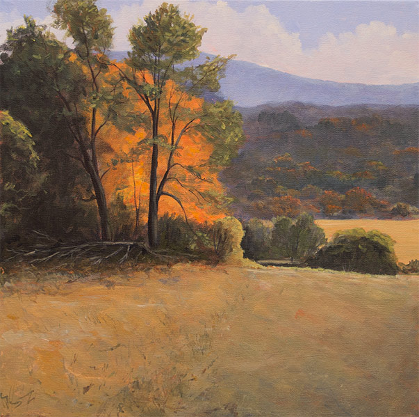
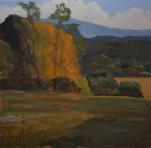
Next I mix varying amounts of my Cad Yellow with Cad Red (light) and in places a little touch of blue for some duller oranges, and enhance the orange/yellow tree. Then I put my dark tree trunks in front of that, adding in the foliage for the green trees that sit in front of the bright orange tree. This contrast of light area and darkest darks in the painting accentuate the luminous feel of that brightly light tree in the background.
The overall color of the orange tree is not much different than the previous step, but the dark contrast brings out the color and luminance.
I finish up by painting the foreground fields, having to change it multiple times to get something I was happy with. And making some changes to the background hill to reduce the color, making it more blue and less saturated, and pushing back the middle-ground trees in the center-right.
Below is how it looked in one iteration of the foreground grass. Not only was the grass too light overall, stealing some of the thunder from the main tree, I also did not like the addition of the fence posts, and remove them later. But notice all the colors in the fields, especially in the lower-right. Good grass fields have lots of colors in them, and layers that make them have depth. I also added the fallen tree that was in the reference photo.

Here, again is the final piece. The darker value in the foreground lets the bright orange tree be more effective. What is interesting is that the orange tree, if you were to remove all color saturation, is a middle value, not much lighter than the grass fields or back-most hill, but it appears brighter due to its saturation and the contrast.
Thanks for reading, subscribe to the right if you’d like to get automatic notifications when I post new items.