The Comparison Trap

After a brief visit to a couple of galleries today my wife said to me “It must be hard as an artist to be surrounded by all that art and not compare yourself to other artists.”

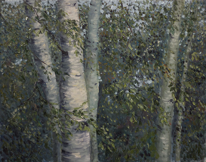
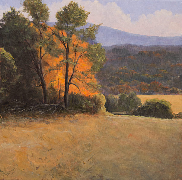
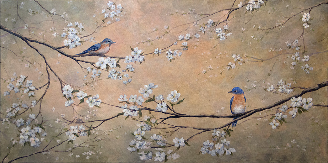
I work in a gallery part-time and I am surrounded by some of the best artists around, many of whom I greatly admire; Eric Tobin, Stapleton Kearns, T.M. Nicholas, Andrew Orr, Kevin Fahey, Emile Gruppe and so many others. It is a blessing and a curse. I can admire and dissect the work of other artists to try to learn how they achieve an effect or render a passage. And, I can get frustrated and wonder if I just started to late to ever achieve the same level of proficiency, to ever be “good enough” to share the same space.

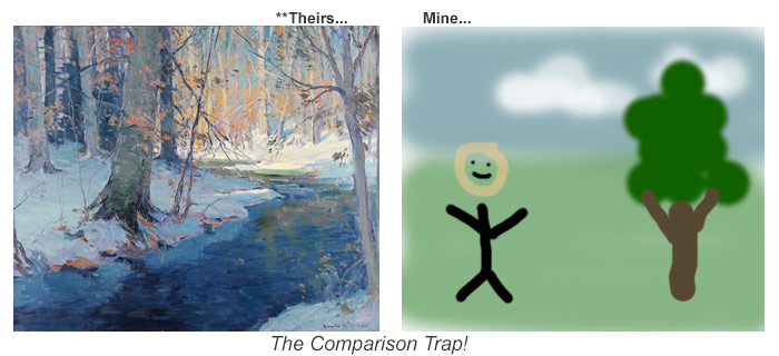
She is, of course, right. It is hard not to look at other artists work and mentally wonder if I’ll ever be “that” good. I doubt there are many artists that don’t, or haven’t at some point, suffered from the same affliction. I call it “The Comparison Trap”.

Continue reading “The Comparison Trap”

Switching to Oils (part 1)

Recently I decided to give oil paints a try. I thought it worth sharing some of my experience and frustrations with the medium. I’ve been working in acrylics exclusively the past few years. And even though I painted using oils in my late teens – that was a long time ago and I don’t remember any of it.

I haven’t actually switched to oils 100% but I want to be able to work in both mediums as the situation and mood demands. So I picked up some Windsor & Newton Water Mixable Oil paints and mediums (water mixable thinner and Liquin) and have been doing a few paintings to get a feel for them.

Coming from acrylics there are some basic things that make oils a challenge. First, the dry times. Since oils take much longer to dry, the approach to a painting has to be different. Unless you paint wet-into-wet with acrylics and use a medium or acrylic paint that stays “open” or wet longer, then you have to rethink your approach to a painting. Instead of layering and correcting colors, values, etc. all in one sitting as you can easily do with acrylics, you have to either scrape off your mistakes, wait a long time between layers, or get very good at painting thin layers that you can then carefully apply a thicker layer over in oils. The challenge is that your paint will readily mix since it stays wet. So careful planning, accurate mixing of your colors, and precise brushwork become more important when using oils.

I will probably anger some acrylic artists with this next statement, but I almost feel that working in oils forces you to be, if not a better artist, a more careful one, than working in acrylics. I know it depends on your style of painting, but in general you will want to have more control over your paint and its application when working in oils, at least working in the “alla prima” (all in one sitting) method. Certainly if you wish to develop a painting slowly over time in layers you can do that in oils, just like with acrylics but over a longer timespan. You have to develop patience. With acrylics I like that I can paint whenever I am in the zone and keep painting for as long as I want. Oils force you to take more time.

Continue reading “Switching to Oils (part 1)”

Ignorance IS Bliss!

Like most artists, when I first started painting I grabbed a couple brushes and a few tubes of paint and gave it a go. It was great fun just trying to paint something and seeing how it came out. I had a vague idea of what I wanted to do, and through trial and error I was able to create something that made me happy. Other people responded well, so I kept at it.

As I continued to paint I started wanting to learn more, to overcome challenges I was having. So on to the internet, websites, blogs, artist pages, and YouTube.

Well. It didn’t take long before I started learning how to mix colors. Cool.

Then, I started learning that I should be paying attention to values. So, more videos, more blogs, more learning. And then, composition. I needed to plan my paintings better to have better composition. Then edges, and blending. Color temperature, brush handling, techniques, etc. etc. etc.

Soon enough I found myself with a dizzying list of things I needed to know, and practice, in order to be “good”. What was once a fun way to splash color on a canvas became a bit intimidating.

I was reminded of this today talking to another artist. He was saying how sometimes when he sits down to paint he starts worrying about the details and loses sight of the big picture. He, like me, would focus on one part of the painting trying to get it right.

Continue reading “Ignorance IS Bliss!”

Painting Luminous Trees

I recently received a question on how I painted some trees in the painting you see below. So I thought I would walk through this painting to illustrate how I went about getting the luminous quality of the backlit tree which is the focal point.

Autumn_Serenity

To start with, since the whole purpose of the painting was to capture that moment when light hits this group of trees creating a backlit glow, I thought about how best to capture that effect using paint. The three things I knew would help in this were the concept of simultaneous contrast (the effects of two colors next to each other), contrast (light and dark) and saturation.

But before working out those details I knew I wanted to start with a colored ground for my canvas, using a color that would enhance the vividness of the orange tree. So I chose to cover my canvas with a combination of Cadmium Red Light and Burnet Umber. I could have chosen to use Yellow Ochre, but I wanted the red ground to add some energy to the hills and greens so I went with this choice. I knew the orange/yellows on top would pick up some of the undying redness and energy of the ground anywhere it peaked through and would maintain its brightness on top of it. Continue reading “Painting Luminous Trees”

Bluebirds & Dogwood (in 12 steps)

Here is a breakdown of how I approached my latest painting. The painting itself was a request, and for guidance I had an idea of the color palette and that it should be calming. I also knew it should be fairly large, and in landscape orientation. So I first drew a number of sketches, to get a general idea of the composition. Then it was time to paint. I chose a 15″ x 30″ canvas and paint the edges (1 1/4 inch deep)

Step 1: Blocking in the background.
For the background the initial step was just to get color on the canvas. You can see in the photo below that first I blocked in a lot of color in the general color family I wanted for the final result, but without worrying at all how it looked. The photo below shows the end of that block in and the start of step 2.

bluebirds-step1
Step 1: Background Block-In


Step 2: Working the background for atmospheric effect.
For this step I worked with the same color palette I used for the blocking in of the background, but now started applying final color in blotches using a 1″semi-soft synthetic brush that let me blend the splotches as I went. As I worked I would adjust the colors, lighten some areas, and go back over areas to soften or adjust the colors and values. I kept my sketch handy to inform me where I would be putting elements on the canvas so that the background would compliment the focal points. I keep the corners darker and light in the center to draw attention to the middle of the painting and keep attention from leaving at the edges. Continue reading “Bluebirds & Dogwood (in 12 steps)”