Simplifying My Palette!
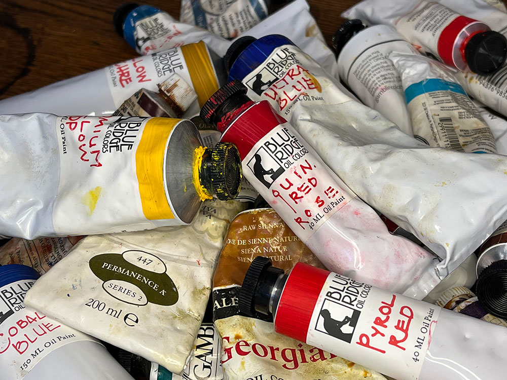
Over the years I have amassed a collection of paints with a dizzying array of color choices. Increasingly I find this to be a distraction. Most artists have been told, or heard, that painting with a limited palette, especially when you start, brings great benefits as it forces you to observe closely and learn color mixing. Many experienced artists stick to a limited palette, sometimes as limited as one each of the three primaries (Red, Yellow, Blue) and white and black. A greater number choose to use a warm and a cool hue of each of the primaries.
I find I have come to rely too much on handy color choices that allow me to be lazy. One of the downfalls of having too many color choices is a loss of harmony. Not all color hues mix well or work well together. Relying on a new color can actually disrupt the rest of the painting. Not to mention the difficulty of keeping all those different colors stocked and on your palette.
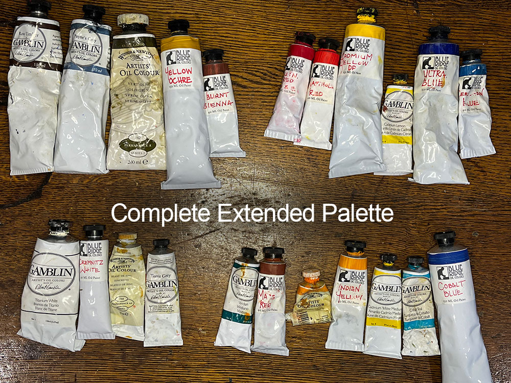
So I am choosing to pare back the number of colors I rely on in different situations. I still don’t plan to go minimalist, and I have a few colors I have come to rely on and know their properties well, but I intend to use a fixed base palette of just a six colors, plus white and a deep grey, and a few earth tones. I will augment this with some reserve colors for when the situation calls for something not easily mixed from the base palette.
Reds!
Choosing which two reds to use on my base palette was the hardest choice. I have tried so many reds I can’t keep track of them all. So limiting reds to two, a warm and a cool, was a difficult challenge. In order to tackle it I created a color chart using several reds and some of the possible yellows I planned to choose from. The image below shows some of this process.
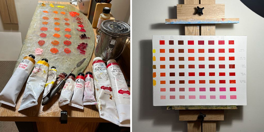
I have chosen Quinachridone Red Rose for my cool red. It mixes nicely with many yellows to give a strong orange, and nice purply-pink when lightened with white. For my warm red I have chosen Napthol Red, which is a strong tinting red. Both are semi-transparent. The choice of Napthol Red is in place of Cadmium Red, which is more opaque, but I hope to, over time, move away from the Cadmiums due to their health properties.
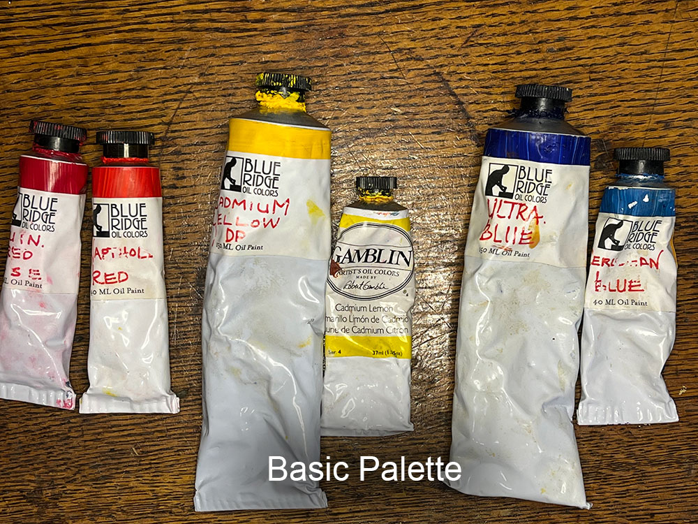
Base Palette
So here is my “Basic” palette.
Quinachridone Red Rose (cool red)
Napthol Red (warm red)
Cadmium Lemon (cool yellow)
Cadmium Yellow Deep (warm red)
Ultramarine Blue (warm blue)
Cerulean Blue (cool blue, situationally replaced with Cobalt Blue)
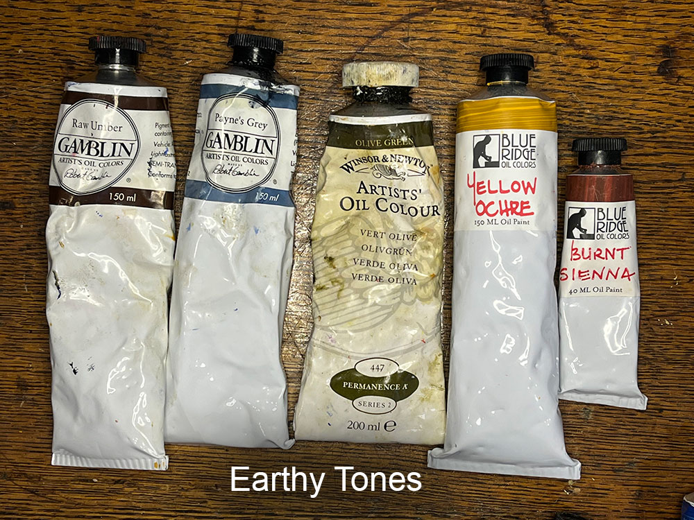
Added to the based palette of a warm and a cool primary color I have chosen an ‘earth tone’ color for each color group.
Burnt Sienna – this gives me a nice red-leaning shade that will mix well to create some good earthy browns and tone down some of the other reds.
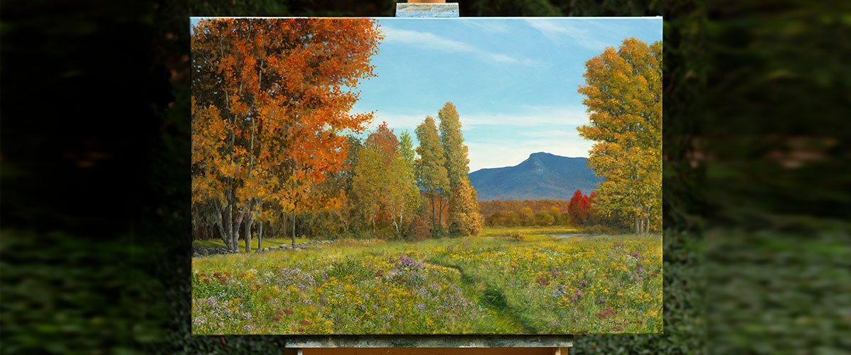
Yellow Ochre – is a versatile yellow that I use a lot when mixing greens. When mixed with reds it also creates the nice rusty oranges that dominate the autumn landscape here in Vermont.
Paynes Grey – which is the closest color I have to black, has a dark blue undertone and is almost always my starting color for mixing my greens.
Olive Green – for a long time I did not have a green on my palette as I choose to mix my own from my other colors. However I have found this Olive Green from Winsor and Newton to be a versatile dark green that is very close to the greens in the landscape right out of the tube and that I can push in different directions. I can also mix it with red for a rich, warm dark color.
Raw Umber – I don’t know of anyone, unless they limit themselves to just three colors, that does not have Raw Umber on their palette. A versatile deep, opaque brown it is great for sketching on the canvas, bringing the tone down in ultramarine blue, and mixing neutral colors and grey. Raw Umber and Ultramarine Blue is my go-to mix for a deep black color.
Those 11 colors above, and white, are the ones I plan to rely on for the bulk of my painting, and will be the only ones I take with me when painting en-plein-air. However there are some colors which I have come to love in certain situations. These are my “Extended” or “Supplemental Palette”. These are not so much necessary colors as ones that are really nice to have in certain situations.
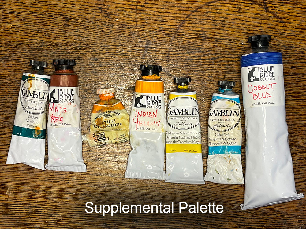
Starting left-to-right: Viridian is the only other color green I sometimes use instead of mixing from scratch. I rarely use it, but it does give an option to kick up the saturation of some dark greens into something more lush. A cool green it can be used with white and other hues to make some nice cool shadows.
Mars Red is a very strong, overpowering red. I used to use a red from Blue Ridge Oils called Terra Rosa until they discontinued it (it has since come back) but Terra Rosa was a mix of Mars Red and I think Napthol Red. So I bought both and mixed my own. However I find the Mars Red to be a good color when I need a really strong dark red, and may use it for initial lay-in in place of something such as Transparent Oxide Red. Mars Red is more opaque, and warm and can really add some punch when mixing oranges.
Cadmium Orange is a color I used to use a lot, but increasing find I only need it in limited situations when I really want that punch of pure orange. However this is very rare and I find I can mix great oranges with my other reds and yellows.
Indian Yellow is one of those yellows that is very close to orange but mixes more like a yellow than a red. Indian Yellow also comes very close to the orange you find on autumn leaves, and mixes with a warm red for a bright warm orange.
Cadmium Yellow Medium is in-between Cad Yellow Deep and the Cad Lemon. Warmer but darker than the lemon it can be a good color to lighten a mixed orange or warm red, and sometimes I use it to create nice greens.
Cobalt Teal is a guilty pleasure. I LOVE adding a little Cobalt Teal to certain sky mixes. It creates a brighter, more energetic color than my other blues, and when you really need an electrifying fresh light green adding this you your green mixes produces some interesting results.
Lastly we have Cobalt Blue, which I mentioned previously, can replace Cerulean Blue on my palette. Sometimes a summer sky is just so Cobalt Blue there is no substitute for it.
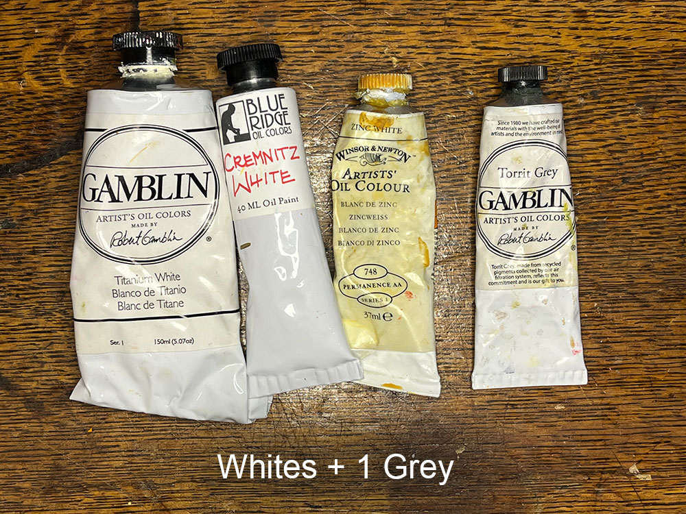
White & Black
So far I have only made passing mention of white and black. My primary white is Titanium White which I use 95% of the time. However Titanium White is a cool white and tends to make mixes with other colors somewhat chalky in appearance. Because it is cool, it can deaden some warm color mixes. It is very opaque and that helps when you need to make a transparent mix more solid.
Sometimes you need to ‘lift’ the tone of a color without intimidating it’s color too much. Zinc White is a nice transparent white that lets you do this. It avoids both the opacity of Titanium as well as the chalkiness.
For a nice warm white, Cremnitz White is a choice that avoids the cool shifting properties of Titanium. It is also semi-transparent.
I also keep a grey on my extended palette that is a warm neutral grey. Seldom used it can be helpful when I need to just grey down a color quickly. However this may find its way off my palette since mixing compliments creates a nice array of greys.
Black is a problematic color in that black is very deadening. It can leave a dark, dull mark on your painting. The solution is to mix a black that has more color. My choice for black, as I mentioned above, is Ultramarine Blue and Raw Umber. Napthol Red and Olive Green creates a warmer black, and Paynes Grey mixed with green, burnt sienna or even Mars Red can create interesting darks.
Now that you know my preferred palette going forward let me share my preferred companies. Some colors I have are inherited from another generous artist, some I can only find from limited suppliers, however here are the companies that make the colors I chose.
Blue Ridge Oils is a family run business with paint made by Eric Silver in Asheville North Carolina. I absolutely LOVE these oil colors. Rich and buttery, with great pigment load these colors are a pleasure on the brush and on the canvas. The only drawback to these colors is that many are mixed with a blend of linseed and walnut oil. Walnut oil dries more slowly so overall these paints dry a bit slower than many other brands. It teaches me to be a bit more patient and that is not a bad thing, but at times I do get frustrated with the slow drying time. This reason alone could make them less appealing to purely plein-air painters as they don’t ‘tack-up’ as quickly to allow easier layering when painting all-prima.
Gamblin Oil Colors: One of the best and biggest names in oil paint, Gamblin has been mixing and selling painting for a long time. They make a rich cream paint, not as buttery as Blue Ridge Oils above, but still a nice paint. I get my Paynes Grey from them (Blue Ridge does not offer it) and prefer my Titanium White from them since it dries a little faster so that helps in all my mixes using white.
Winsor & Newton, another household name in oil paint, is my source for Olive Green which many manufacturers do not make. I also get my Zinc White from them as Blue Ridge Oils does not make a zinc white.
There are other great brands and as long as you know their properties it comes down to personal preference.
If you made it this far I hope you found it enlightening. For my part I hope limiting the colors I use in my paintings will lend itself to more color harmony and a greater knowledge of how each color on the palette can be utilized to it’s greatest affect.