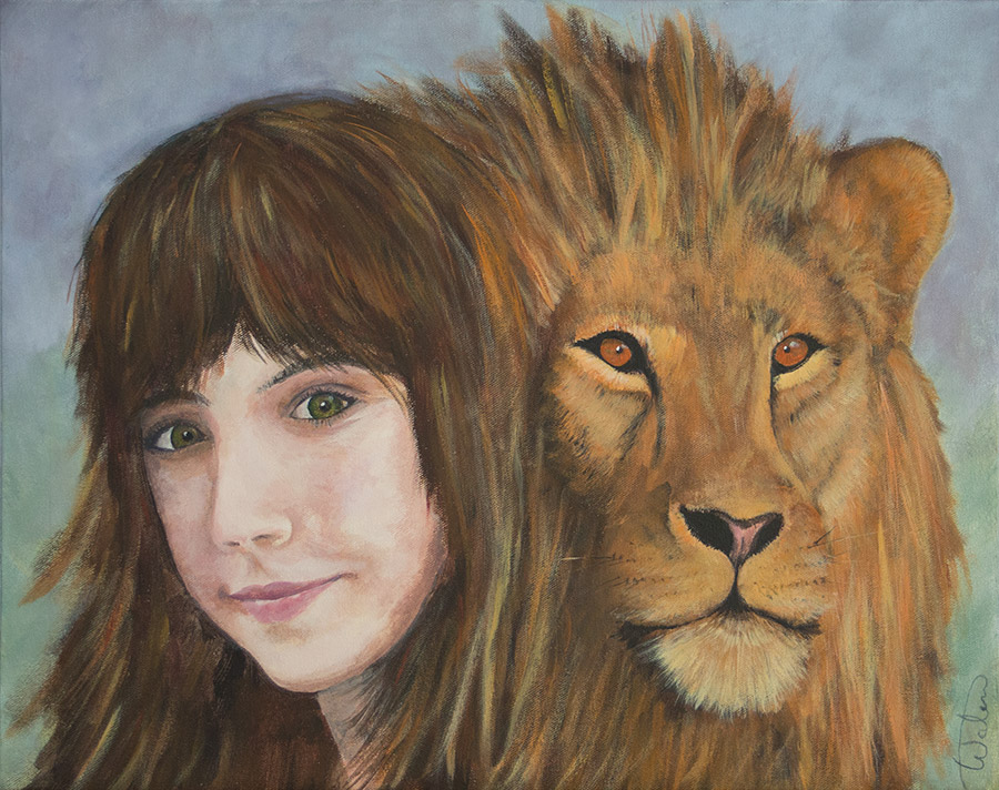
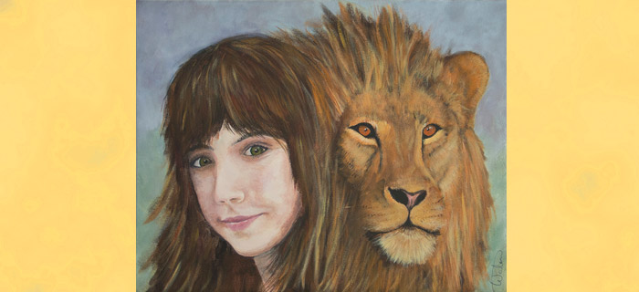
My most recent painting is a complete departure from my usual landscapes. Titled “The Lion and the Lioness” it is a portrait, well two portraits really, of my step-daughter Liza who is returning today from a 5 week trip to Namibia Africa (and her lion friend). Four of those weeks she spent working at an amazing animal rescue and rehabilitation center, where she fed and cared for lions, cheetahs, merkats, baboons, monkeys, warthogs, and a very long list of other animals big and small.
I wanted to give this amazing person something to always have of this amazing experience she had (not that she could ever forget.) So I thought why not pair these two magnificent beasts, the king of the jungle and queen of the mall :-), and do a portrait of the two of them, their beautiful manes mingling and representing the joining of two cultures, two creatures, two souls. Africa stole her heart but we are glad to have her home.
And lest you think the pairing of these two improbable, below is a photo of her on a “Cheetah sleep-out”. Yes they really did get up close and personal with many of these magnificent animals. Some of whom are returned to the wild, some of whom were raised from birth (like this cheetah).
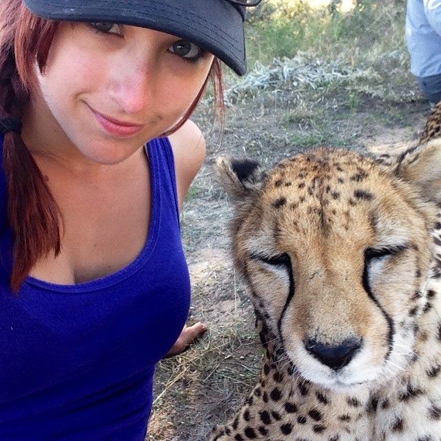
This is the first time I have ever attempted a portrait, and I never actually thought I would or could pull it off, but I have to say I am pleased with how it came out. I approached it like any other painting, and if you’d like to see the evolution of this painting keep reading…
Step 1:
Once I got past the intimidation of doing a portrait here is how I approached it. I confess to not having the greatest of drawing skills, and I have never learned or practiced drawing human anatomy or faces. So I resorted to creating a grid pattern to get my drawing right (or mostly right). I choose a photo of Liza and cropped it to fit the canvas size, combined with a lion photo. Then I drew a grid proportional to a 1″ grid pattern. This became the basis for my drawing.
I used reference photos for the lion, not having a fully grown male lion hanging around, and for the reference photos I turned to paintmyphoto.com (http://paintmyphoto.ning.com.) This is a wonderful site all artists should belong to. Photographers freely share their photos for use by artists without copyright restrictions. You can use it to find things to paint, or references for parts of your work. Its free, and they have discussion groups, contests, and more. And you then can post your artwork – as long as you reference the photo you used.
In photoshop I combined the two photos to get a composition I thought would work.
Then I transferred that drawing to the canvas (16″ x 20″) after marking out the grid in pencil in 1-inch increments. I transferred it by lightly drawing with pencil on the canvas. In some ways, using a grid frees you from thinking as much. I can tell you without a doubt, that had I tried to draw without the grid my proportions would have been all wrong. I never would have gotten either the size, or the placement of nose, eyes, mouth correct had I not used a grid. At times it almost seemed wrong, but the evidence was in front of me.
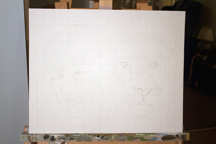
Step 2: The next step was to actually outline and start to draw the subjects in paint. I used burnt sienna to establish the drawing and start to indicate some areas of value in the face. I figured I would start with her face as this was going to be the most challenging for me, and if I failed I could bail before having too much time invested in other areas of the painting. So I started to shade around the eyes cheeks and chin to get a better feel for how well I got the drawing. At this point I did NOT recognize a couple errors in the drawing that would cause me problems later (more on that below), but overall I thought I was off to a decent start. I also started the background color which I wanted to use a compliment of the reds/yellows/oranges of the fur and hair.
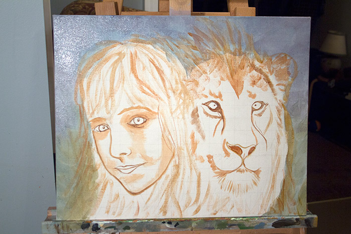
Step 3: Wile probably not the logical progression, I was still worried about my ability to paint her face. I approached it like I would a landscape, in that I knew I would be painting multiple layers, blending color shapes, and establishing light as I went along. More than any other time I have painted getting the values right seemed most important for the face. This worked pretty good. If I got a skin tone wrong I could go over it (and did!) either with fresh paint or with a tint or wash to shift the color and/or value. And I detailed the eyes more than maybe I should have initially, but I knew that the eyes of both Liza and the Lion were going to be the focal point and make this painting work or not work.
The painting of the face was challenging and I would return to it throughout. But knowing I could come back and adjust and fix things helped me get through it. However it was mostly a case of layering color, and blending. I obviously was not going for a smooth continuous toned blend, but it took a lot of attention anyway. Below is the underpainting of the face complete, establishing the overall relative shading. The final image shows the successive reworking and layering of skin tones.
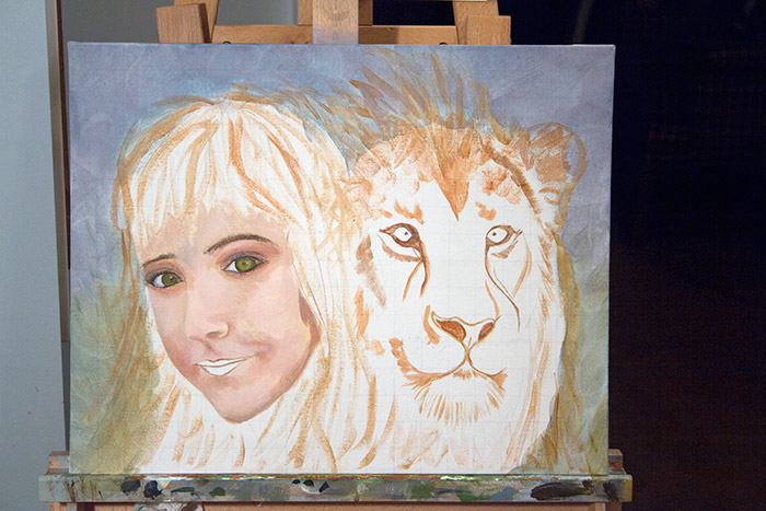
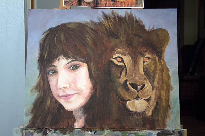
Step 4: I am missing an image I should have here, where I start to block in the rest of the painting, outlining the Lion and roughly establishing the darks. But the image below shows how I establish a dark underpainting for the hair and lion since I knew that I wanted those dark hairs and shadows underneath the eventual lighter hair and fur. This is where you have to look past this step when you are painting and trust that its necessary to get to the next stage.
I paid attention to the brush strokes to establish the flowing of the mane(s) and mingling of hair between the two of them. And I established the placement of the Lion’s eyes to be sure I had them where they belonged, but otherwise did not worry about how dark he looked. I also made sure to use the colors in Liza’s hair in some of the lion’s hair and vice-versa to tie the two sides together. Liza has a dark red undertone in her hair that I would work in a little here, and then glaze in a little at the end.
Step 5: On to the good stuff. In this step I work on getting the lights of the lion’s hair, completing his eyes, and overall working the painting into what it will mostly look like when finished. It was during this stage that errors in my initial drawing started to show themselves. Without belaboring it I had not done a good job of checking the lie of the eyeline, eyebrows, nose, and mouth. They didn’t all share the same lie (or angle). If you put a ruler across each they should hold the same angle, and even after adjustment I did not get it perfect, but it was obvious to me that it was not right so I had to fix it.
Fixing it (or at least making it better) involved lowering the right eyebrow (as you face the image, her left) and bringing the angle of the mouth more in line with the other facial elements. This meant repainting. In the end I can still see its not perfect, but it is no longer obvious or bothersome to me so I am happy I went back and did this. Along the way I tweaked the face to make it look more like Liza. In the missing photo (the one I should have taken) her lips are too thin and expression too serious.
A lot of time was spent now getting color into the lion and establishing all that fur and hair. I resisted getting too detailed, and the outside edges purposefully loose and general for the entire piece, as I wanted the detail in the eyes and faces to be the attraction. Too much detail in too many areas makes the viewer want look at too much. Keeping your details on your focal points is a good rule of thumb.
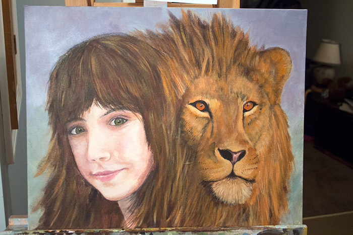
Step 6: Final details, highlights and glazing. For the final image I decided the lion was still relatives too dark so I went back and lightened up the fur and mane with highlights. Here is where its important to let go of your reference photo and just paint what feels right. Without worrying about trying to duplicate a photo I was able to work in the amount of highlights and color I wanted. This included adding subtle red highlights in her hair, and using glazes to both brighten up the lion and make him more orange, and to add a touch of red undertone to her hair. (the glazing actually shows in the picture above)
Below, again, is the finished piece. And I am happy how it came out. But very proud of Liza and her adventure. I hope she has many more, and I hope they inspire me to paint! Welcome home Liza!
This is a wonderful painting! And I loved reading about your process, Tom. Wow. What a beautiful way to honor Liza and her adventure. I think she and the lion are indeed kindred spirits. A great story.
Thanks Betty. Kindred spirits indeed!
Excellent web site you have here.. It’s difficult to
find good quality writing like yours nowadays. I really
appreciate people like you! Take care!!